Toolbox
Toolbox
Before you begin…
The most important step in any print job starts with the planning and set-up of your documents. There are numerous technical considerations that may impact the success of your printed materials. Things like paper type, texture and weight can affect how your project looks when completed. An image can look very different printed on one type of paper than another. Other considerations are whether to print process color or spot color, ensuring that your artwork and photos have enough resolution to print clearly, adding bleed to your document, making sure that your document is set-up to fold or perforate correctly. These are all things we can help advise you on so please do not hesitate to contact us for assistance. We’ll be happy to offer advice or suggestions to ensure that your project is successful.
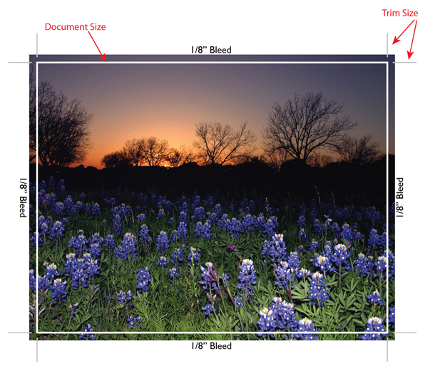
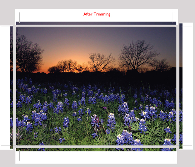
Bleed
Bleeds refer to printed colors that extend past the edge of a page. To accommodate a bleed, the printer must print the bleed area larger than the final trim size. The printed image extending beyond the bleed area is then trimmed off so that the printed area extends to the edge of the sheet. Bleeds require more paper and production time, thus printers charge extra for this service.
Color
One of the greatest challenges in producing color for print projects is making sure the colors the designer has chosen or created are the same colors that are printed. In creating a project, several devices are used and no two of them produce the same visual color from the same digital values. Images scanned as RGB (red, green, blue) can look different when viewed on different monitors.
Colors viewed on a monitor can look different than the same colors output from an inkjet printer or printing press, which both use CMYK (cyan, magenta, yellow and black) for color reproduction. With monitors, printers and presses all using different varieties of color, keeping the color consistent throughout the production of a job is very challenging. You must have a basic understanding of the additive and subtractive color processes and use a Color Management System (CMS) in order to get consistent and reliable color.
Before actually printing with color, it is necessary to understand some of the factors that influence the appearance of colors on a printed document. Listed below are some of the important points to consider.
- Although color guides are a good tool for determining the color that should be used (such as spot colors) they should be used only as a guide. There is no guarantee the final printed color will look exactly like the color in the guide. The colors in the guides tend to fade so the guides are usually valid for about a year. The color swatches in a guide are usually printed with a saturation that may be hard to achieve on some applications.
- The type of paper on which color is printed has a huge affect on the way the color appears. The same color will appear to be quite different when printed on coated and uncoated papers. The ink absorption rate, along with the brightness and the color of different papers can result in significant changes in the way color appears on different papers.
- There can be differences in ink pigments between different ink manufacturers which is another reason why it is difficult to perfectly match the color in a guide. Most printers use ink from one vendor so they can usually expect consistency in the ink they use.
- Lighting conditions affect the appearance of the ink color. Differences in daylight during different times of the day and differences in artificial illumination, such as fluorescent and incandescent, can cause a wide shift in the appearance of a color.
Color Theory
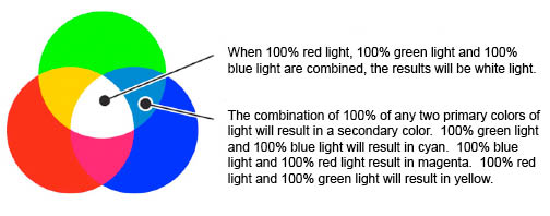
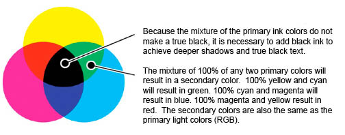
Red, Green and Blue (RGB) are the primary colors of white light and are called the Additive Primary Colors. We are able to see color because different objects reflect and absorb, or subtract, the primary colors of light differently. For example, we see an object as yellow because it absorbs (or subtracts) blue light from white light. Since the blue light has been absorbed, the red and green light is leftover and is reflected back to our eyes. The red and green light combine to make yellow and so we see the color of the object as yellow. This is known as the Subtractive Color Process because portions of the visible light spectrum are subtracted from white light to reveal color. If 100% of the red light is subtracted from white light, the resulting color is cyan. (The green light and blue light are the remaining primary light colors after the red is removed and the green and blue combine to form cyan).
If 100% of the green light is subtracted from white light, the result is magenta (red and blue light form magenta) and when 100% of the blue light is subtracted from white light, the result is yellow (red and green light form yellow). Cyan, Magenta, and Yellow (CMY) are the Subtractive Primary Colors, and are used for color reproduction in process color printing. Because the mixture of the primary ink colors do not make a true black, it is necessary to add black ink to achieve deeper shadows and true black text.
Additive Color
Subtractive Color
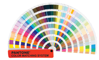
Spot Color
Spot color is usually considered to be any color used on a document that is not a process color. It can be used simply as a secondary color or as a color to provide emphasis to an area of a printed piece. Spot colors can be used as an area of emphasis on a four-color process job with the spot color generally printed as a color on a separate plate and not as part of the four-color process.
Specialty inks can also be used as a spot color to provide even greater emphasis to an area. Specialty inks can range from fluorescent, fade resistant, opaque, and metallic inks. Many of the specialty inks demand unique considerations for their proper use at the press. Metallic inks may require that the press run at a slower rate than usual and the preparation and clean up time may be longer. Fluorescent inks are very transparent and may require that the printed document be run a second time through the press to achieve the desired coating of ink. The challenges created by the specialty inks in terms of printing may increase the price of a printed document to a degree that it may not be cost effective to use the specialty ink for a particular application unless a large quantity is produced.
If spot colors are used in your project, specify the appropriate PMS colors in your color palette or selection. Different programs name PMS colors a little differently so, for example, if you create a document with a PMS color in Illustrator and bring it into Quark, you could end up with 2 different swatches for the same color which would produce two separate printing plates instead of the one plate that was intended for the spot color.
The Pantone Matching System includes swatches for hundreds of spot colors, process colors, fluorescent colors and simulated metallic colors. A Pantone swatch book may include the same colors printed on coated and uncoated papers which allows you to see the change in the color from coated to uncoated stock. You can see which palette of colors you have by bringing up the “Print” menu and selecting “Separations.” The colors will be listed in order.
Four-Color Process Printing
Printing an image in full-color is a complicated process involving a number of steps. A basic knowledge of these steps is not only essential for printers but it is also important for designers in planning and creating the best layouts and for print buyers in understanding some of the issues that are raised when purchasing color work.
In order to reproduce or prepare a full color image for printing using four process colors, the image must be divided into the individual subtractive primary color components. The separation process can be accomplished photographically or electronically.
Color Tips
- Pure violets, greens and oranges are very difficult to match using four-color process printing. To achieve vibrant colors, a fifth spot color or 6-color high-fidelity printing can be used.
- Fluorescent and metallic colors cannot be achieved by using four-color process printing. A spot color is necessary for printing the fluorescent and metallic colors.
- For a rich black use a mixture of 60%C, 40%M, 40%Y & 100%K instead of just 100% black. The combination of all of these colors in the correct proportions will create a black with a darker appearance.
- When using blue in your design, always make sure to leave at least a 30 point difference in your cyan and magenta values. Blue is close to purple in the CMYK spectrum, so use a low amount of magenta whenever using high amounts of cyan to avoid purple. Example: 60%-C, 30%-M, 0%-Y, 0%-K
- Only 50% of the PANTONE colors can be closely simulated using four-color process printing, but nearly 90% can be simulated with the use of high-fidelity printing.
- Pantone colors in desktop software are not always the same. Always check the built-in percentages.
- Never trust the color on the monitor. It is always best to use the color values and percentages.
- Banding can often occur in gradient blends (vignettes). Banding is the visible lines between the color changes in the gradient. To help eliminate banding, limit the change in a color to no more than 75% from end to end. For example,instead of going from 0% cyan to 100% cyan, start at 10% and end at 80%. If you are using PhotoShop to create the gradient, try adding a pixel or two of noise from the noise filter.
File Formats
Various types of file formats are acceptable for your print projects although some programs provide better results than others. Preferred documents are from the Adobe suite of programs – Illustrator, InDesign, Photoshop and Acrobat. We also accept most file types including Microsoft Word, Publisher, JPG, TIF, PowerPoint and more.
Resolution
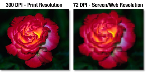
For printed images, the resolution is based on the size of the dots that make up the tonal values of the images. It is usually expressed in dpi (dots per inch). The higher the dpi, the higher the resolution and the higher the quality. A good rule of thumb is to work with an image resolution that is twice the line screen at which your document will print. Most printers print at 133 or 150 line screen so your images should be a minimum of 266 or 300 dpi (dots per inch). Momentum prints using 133 to 200 line screen. This allows you to benefit from higher resolution photos and images at 600 dpi although smaller images at 300 dpi are still acceptable.
If the images/photos/graphics you use in your documents are low resolution, your image may be blurry or you may see the individual jagged pixel elements in the printed piece. Please note that just because your image looks good on screen it may not print well. Your screen resolution is 72 dpi.